Introducing CORITheme
CORITheme.RmdOverview
library(ggplot2)
library(dplyr)
#>
#> Attaching package: 'dplyr'
#> The following objects are masked from 'package:stats':
#>
#>     filter, lag
#> The following objects are masked from 'package:base':
#>
#>     intersect, setdiff, setequal, union
library(CORITheme)
Creating CORI-Themed Bar Graphs
Like line graphs, bar charts can show trends in data quite effectively. However, bar charts are particularly useful (and especially popular) because of their ability to allow audiences to make comparisons quickly and efficiently (for example, one category is twice as large as another category).
One Group
Here’s the simplest type of bar chart. There is just one group visualized over multiple categories. This is what most people picture when thinking about bar charts.
As an example, here’s the population of diffrent races across the United States of America.
#Start off with population data from the U.S. Census Bureau's ACS
data(upr)
upr <- upr[,-c(1)]

ggplot(upr,aes(y=race, x=population)) +
    geom_text(x = 0,aes(label = race),hjust=0,vjust=-2,size=3) +
  geom_bar(stat = "identity",width=0.5, fill = "#01835D")+
    theme_cori() + theme_cori_horizontal_bars() +
  labs(title = "U.S. population by race",
     subtitle = 'All estimates are across 2014.',
x="\nPopulation") 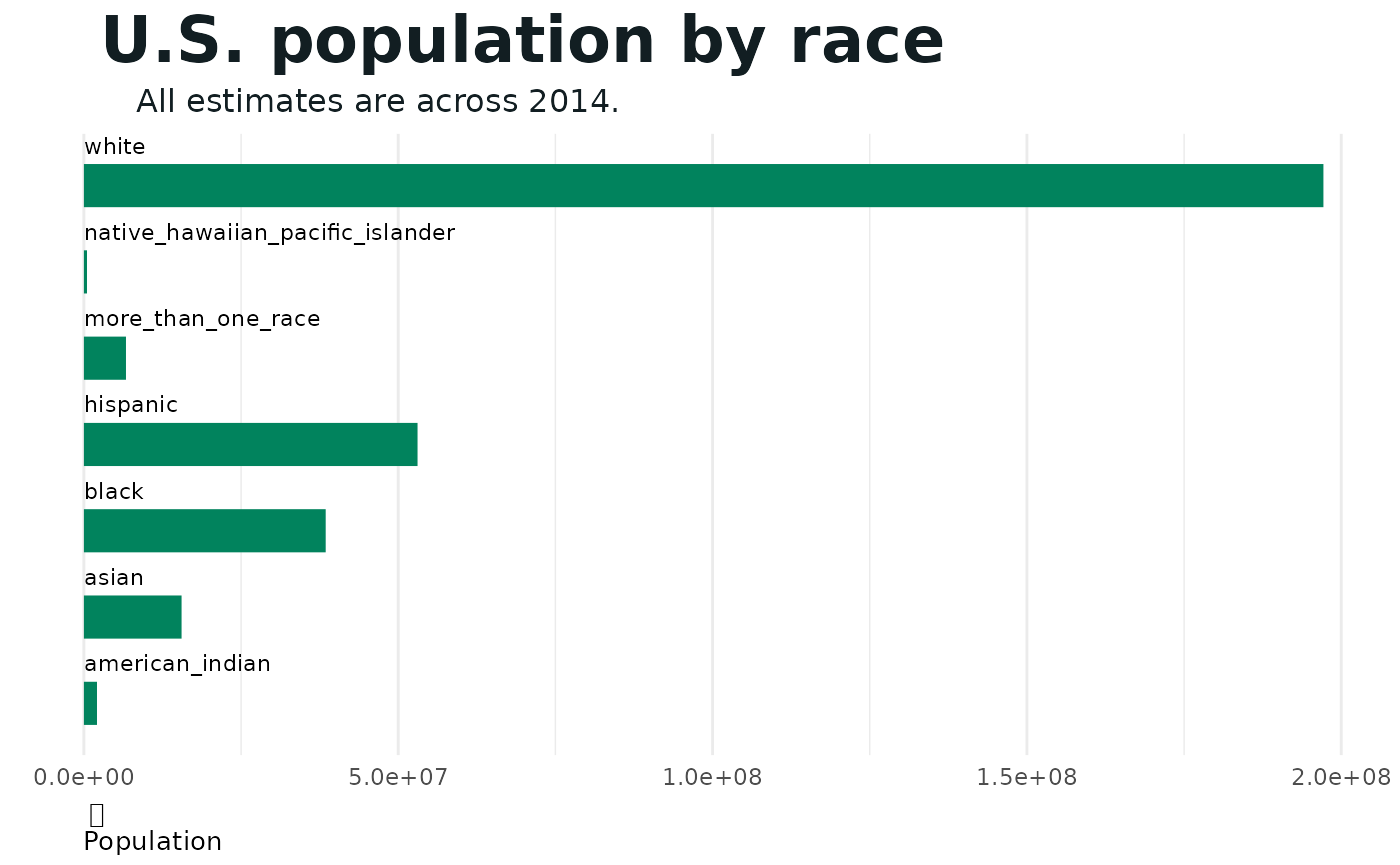
Notice the horizontal format of the bars. This is accomplished by attaching the coord_flip() function to the plot code (as seen above). Use horizontal bars when you have more than items to visualize and when the labels are on the longer side and would appear messy or squished if written along the bottom of the plot.
Tip: The theme also works for vertical bars; simply omit the coord_flip() function.
Two Groups
The beauty of bar charts shines through when using more than one group. This chart format allows for simple comparisons that humans can perceive quickly.
Here’s an example of a dodge chart (one that compares two groups side-by-side). The user can easily compare different unemployment levels in the top five rural counties with the highest unemployment levels.
#  Rural counties with the highest number\nof unemployed people
data(rcu)
rcu <- rcu[,-c(1)]
rcu$year <- as.factor(rcu$year)

rcu %>%
    ggplot() +
    aes(x=st_cnty, y=tot_pop, fill=year) +
    geom_bar(position="dodge", stat="identity", width = 0.7) +
    # geom_text(x=10000, y=0, aes(label="Persons")) +
    cori_legend(title="Rural Counties") +
    labs(title="Rural counties with the highest number\nof unemployed people",
         subtitle="Pulaski, MO saw the highest number of unemployed\npeople in both 2014 and 2019.",
         caption="Source: U.S. Census Bureau",
         y="Population"
         ) +
    scale_fill_cori(palette = "ctg2gn", discrete = TRUE) +
    theme_cori(base_font_size = 14)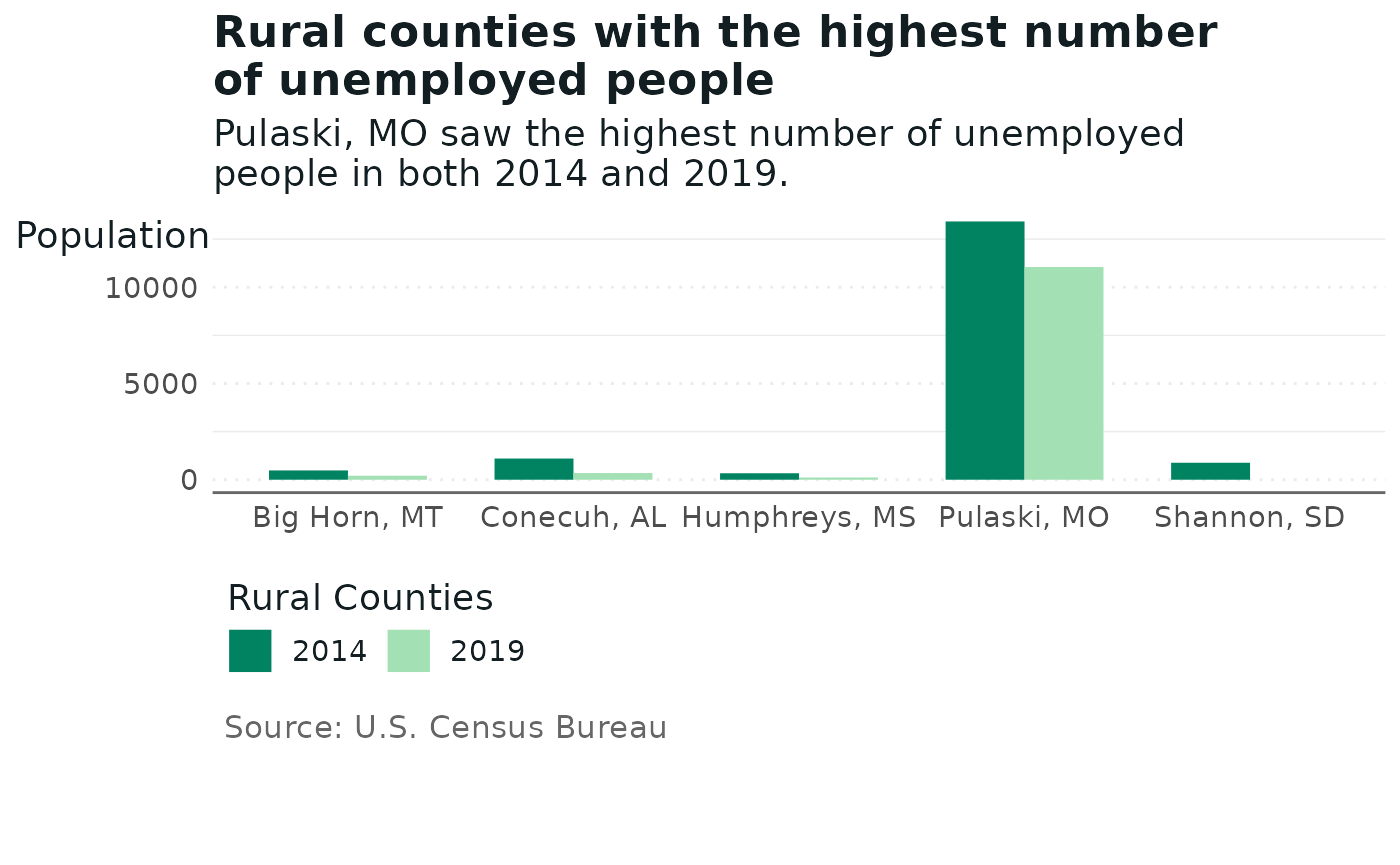
Tip: The theme is quite flexible. The x-axis can support any type of categorical variable, whether it is geographic, race or time data.
Similar to dodge charts are stacked charts in which the groups are stacked instead of next to each other.
Here’s an example comparing the Asian and Hispanic populations in various rural communities.
#Start off with population data from the U.S. Census Bureau's ACS
data(pbra)
pbra <- pbra[,-c(1)]

ggplot(pbra, aes(x=county, y=population, fill=race)) +
    geom_bar(stat='identity') +
    labs(title = "Asian and Hispanic populations\nin rural communities",
         subtitle = 'All estimates are across 2019.',
         x="Year",
         y='Population') +
    theme_cori() +
    scale_fill_cori(palette='ctg2gn') + #Use the color palette for the two greens
    cori_legend()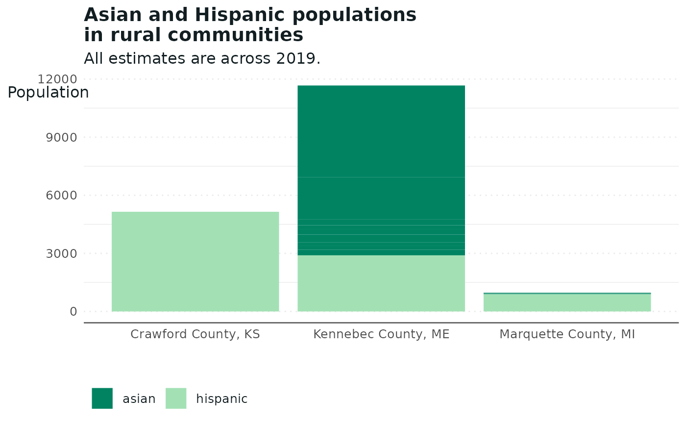
Tip: For added clarity and a greater sense of the data, the package allows you to add a horizontal trend line with an average.
Another interesting way to visualize the comparisons between two groups is to use a population pyramid. At its core, this is simply two bar charts that are rotated and positioned side-by-side.
The following example compares the share of individuals with high-speed internet in Jefferson County, Alabama, over time, broken down by race.
#Start with data on high speed internet access in Jefferson County Alabama
data(ias)
ias <- ias[,-c(1)]

ggplot(ias, aes(x=as.factor(year), y=percent_high_speed_internet, fill=race)) +
    geom_bar(data = subset(ias, race=="black"), stat = "identity") +
    geom_bar(data = subset(ias, race=="white"), stat = "identity", aes(y=-percent_high_speed_internet)) +
    coord_flip() +
    labs(title = "Percent with high-speed internet\nin Jefferson County, AL",
         subtitle = 'High-speed internet rates among White individuals were\nalmost double what they were among Black individuals.',
          x="Year",
          y='\nPercent with high-speed internet') +
    theme_cori() +
    scale_fill_cori(palette='ctg2gn') +
    cori_legend()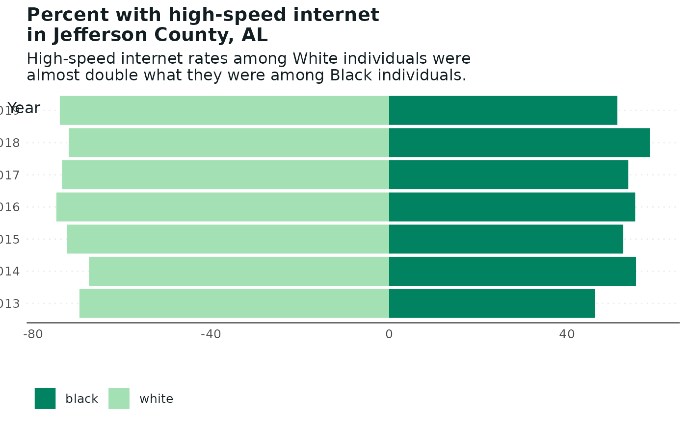
Tip: Use this graph format to compare two groups over time. It is usually used for comparing men and women, but it works as well for other categories.
Tip: Note that the time variable (x variable) must be a factor.